


-
remise en place
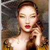
Retour sur le principe de code, déjà proposé en d'autres dimensions: ici en 800x600px; survolez le montage

<div id="fd">
<p id="bt1"><img src="http://ekladata.com/omkHvdI_dFfTblNPmCdbri94EL8/1px-par-1px.png" alt="" /></p>
<p id="s1"> </p>
<p id="s2"> </p>
<p id="s3"> </p>
<p id="s4"> </p>
<p id="s5"> </p>
<p id="s6"> </p>
<p id="s7"> </p>
<p id="s8"> </p>
</div>
<style type="text/css"><!--
#fd{position:relative; width:800px; height:600px; margin:10px auto; border:0px ridge white;}
#s1{transition:all 2s linear 0s; position:absolute; transform:translate(600px,200px) rotate(-10deg); width:200px; height:300px; border:3px solid white; box-shadow:3px 3px 5px black; background:url('http://ekladata.com/8saVHrqbzuq7ZzXnh9xuPSaU8UY.jpg'); background-position:0% 0%;}
#s2{transition:all 2s linear 0s; position:absolute; transform:translate(300px,100px) rotate(40deg); width:200px; height:300px; border:3px solid white; box-shadow:3px 3px 5px black; background:url('http://ekladata.com/8saVHrqbzuq7ZzXnh9xuPSaU8UY.jpg'); background-position:33.3% 0%;}
#s3{transition:all 2s linear 0s;position:absolute; transform:translate(100px,150px) rotate(0deg); width:200px; height:300px; border:3px solid white; box-shadow:3px 3px 5px black; background:url('http://ekladata.com/8saVHrqbzuq7ZzXnh9xuPSaU8UY.jpg'); background-position:66.6% 0%;}
#s4{transition:all 2s linear 0s;position:absolute;transform:translate(100px,50px) rotate(25deg) ; width:200px; height:300px; border:3px solid white; box-shadow:3px 3px 5px black; background:url('http://ekladata.com/8saVHrqbzuq7ZzXnh9xuPSaU8UY.jpg'); background-position:100% 0%;}
#s5{transition:all 2s linear 0s; position:absolute; transform:translate(400px,300px) rotate(-40deg); width:200px; height:300px; border:3px solid white; box-shadow:3px 3px 5px black; background:url('http://ekladata.com/8saVHrqbzuq7ZzXnh9xuPSaU8UY.jpg'); background-position:0% 100%;}
#s6{transition:all 2s linear 0s; position:absolute; transform:translate(500px,150px) rotate(20deg); width:200px; height:300px; border:3px solid white; box-shadow:3px 3px 5px black; background:url('http://ekladata.com/8saVHrqbzuq7ZzXnh9xuPSaU8UY.jpg'); background-position:33.3% 100%;}
#s7{transition:all 2s linear 0s;position:absolute; transform:translate(100px,300px) rotate(-30deg); width:200px; height:300px;border:3px solid white; box-shadow:3px 3px 5px black; background:url('http://ekladata.com/8saVHrqbzuq7ZzXnh9xuPSaU8UY.jpg'); background-position:66.7% 100%;}
#s8{transition:all 2s linear 0s;position:absolute; transform:translate(450px,70px) rotate(10deg); width:200px; height:300px; border:3px solid white; box-shadow:3px 3px 5px black; background:url('http://ekladata.com/8saVHrqbzuq7ZzXnh9xuPSaU8UY.jpg'); background-position:100% 100%;}#bt1{position:absolute; z-index:15; width:800px; height:600px; background-size:cover; transform:translate(0px,0px);}
#bt1:hover ~ #s1{transform:translate(0px,0px); border:0px solid white; box-shadow:0px 0px 0px black;}
#bt1:hover ~ #s2{transform:translate(200px,0px); border:0px solid white; box-shadow:0px 0px 0px black;}
#bt1:hover ~ #s3{transform:translate(400px,0px); border:0px solid white; box-shadow:0px 0px 0px black;}
#bt1:hover ~ #s4{transform:translate(600px,0px); border:0px solid white; box-shadow:0px 0px 0px black;}
#bt1:hover ~ #s5{transform:translate(0px,300px); border:0px solid white; box-shadow:0px 0px 0px black;}
#bt1:hover ~ #s6{transform:translate(200px,300px); border:0px solid white; box-shadow:0px 0px 0px black;}
#bt1:hover ~ #s7{transform:translate(400px,300px);border:0px solid white; box-shadow:0px 0px 0px black;}
#bt1:hover ~ #s8{transform:translate(600px,300px); border:0px solid white; box-shadow:0px 0px 0px black;}
--></style>
montages par codes HTML/CSS
 Créer mon blog