


-
Photos verticales au survol
Pratiquement le même code qu'au clic mais au lieu de cliquer sur chaque bouton (#on1:focus ~ ~gh1;) on le survole: (#on1:hover ~ ~gh1;).
Survol de chaque bouton pour afficher une nouvelle image.
L'animation est celle de votre choix, le nombre d'images/boutons également.
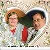
Dans cet exemple; chaque image est en vertical et au ratio 16/9.
<div style="width: 25.3vw; height: 45vw; margin: 2vh auto; border: 0.2vh solid white; background: linear-gradient(to bottom, rgba(50,100,150,0.9) 0%, rgba(50,100,150,0.5) 100%);"><input id="ong1" class="ong" type="text" value="A" /><input id="ong2" class="ong" type="text" value="B" /><input id="ong3" class="ong" type="text" value="C" /><input id="ong4" class="ong" type="text" value="D" /><input id="ong5" class="ong" type="text" value="E" /><input id="ong6" class="ong" type="text" value="F" /><input id="ong7" class="ong" type="text" value="G" />
<p id="gh0"><br /><br />Survol de chaque bouton pour afficher une nouvelle image.<br /><br />L'animation est celle de votre choix, le nombre d'images/boutons également.<br /><br />Dans cet exemple; chaque image est en vertical et au ratio 16/9.</p>
<p id="gh1" class="gh"> </p>
<p id="gh2" class="gh"> </p>
<p id="gh3" class="gh"> </p>
<p id="gh4" class="gh"> </p>
<p id="gh5" class="gh"> </p>
<p id="gh6" class="gh"> </p>
<p id="gh7" class="gh"> </p>
</div>
<style><!--
.ong{position:absolute; z-index:15; width:1vw; height:2vw; border:0.1vh solid black; box-shadow:inset -0.2vh -0.2vh 0.2vh black;text-align:center; line-height:2vw; font-size:1vw;}
#ong1{transform:translate(24vw,0vw);}
#ong2{transform:translate(24vw,2vw);}
#ong3{transform:translate(24vw,4vw);}
#ong4{transform:translate(24vw,6vw);}
#ong5{transform:translate(24vw,8vw);}
#ong6{transform:translate(24vw,10vw);}
#ong7{transform:translate(24vw,12vw);}
#gh0{position:absolute; z-index:1; width:23vw; height:45vw; text-align:center; font-size:1.5vw; color:white; text-shadow:0.1vh 0.1vh black;}
.gh{position:absolute; z-index:2; width:25.3vw; height:45vw; transition:transform 1s linear;}
#gh1{background:url('http://ekladata.com/-Gwk9dyCFgmDR4Wd6_fkXP9nH4k.jpg'); background-size:cover; transform:translate(0vw,0vw) rotatey(90deg);}
#gh2{background:url('http://ekladata.com/Z90oDByp8_9ks3vGTUqsd4-5O7M.jpg'); background-size:cover; transform:translate(0vw,0vw) rotatey(90deg);}
#gh3{background:url('http://ekladata.com/--S-HcBnqwZJr2XCZ7j4znsELfE.jpg'); background-size:cover; transform:translate(0vw,0vw) rotatey(90deg);}
#gh4{background:url('http://ekladata.com/89o5C5xw9D6rOKqzH_wZwxitZMY.jpg'); background-size:cover; transform:translate(0vw,0vw) rotatey(90deg);}
#gh5{background:url('http://ekladata.com/Sk-0nW3w1CEyBq6IqPiur42MHWg.jpg'); background-size:cover; transform:translate(0vw,0vw) rotatey(90deg);}
#gh6{background:url('http://ekladata.com/hKHjqoBe4FX1XyvSjISAE5oglPI.jpg'); background-size:cover; transform:translate(0vw,0vw) rotatey(90deg);}
#gh7{background:url('http://ekladata.com/J_D5xiHeIdAKdvQVSZ0NjSzMuzs.jpg'); background-size:cover; transform:translate(0vw,0vw) rotatey(90deg);}
#ong1:hover ~ #gh1,#ong2:hover ~ #gh2,#ong3:hover ~ #gh3,#ong4:hover ~ #gh4,#ong5:hover ~ #gh5,#ong6:hover ~ #gh6,#ong7:hover ~ #gh7{z-index:10; transform:translate(0vw,0vw) rotatey(0deg);}
--></style>
montages par codes HTML/CSS
 Créer mon blog