


-
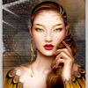
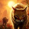
Photos horizontales survol
Le même code au survol avec des images horizontales.
Survol de chaque bouton pour afficher une nouvelle image.
L'animation est celle de votre choix, le nombre d'images/boutons également.
Dans cet exemple; chaque image est en horizontal et au ratio 16/9.
<div style="width: 60vw; height: 33.75vw; margin: 2vh auto; border: 0.2vh solid white; background: linear-gradient(to bottom, rgba(50,100,150,0.9) 0%, rgba(50,100,150,0.5) 100%);"><input id="ong1" class="ong" type="text" value="A" /><input id="ong2" class="ong" type="text" value="B" /><input id="ong3" class="ong" type="text" value="C" /><input id="ong4" class="ong" type="text" value="D" /><input id="ong5" class="ong" type="text" value="E" /><input id="ong6" class="ong" type="text" value="F" /><input id="ong7" class="ong" type="text" value="G" />
<p id="gh0"><br /><br />Survol de chaque bouton pour afficher une nouvelle image.<br /><br />L'animation est celle de votre choix, le nombre d'images/boutons également.<br /><br />Dans cet exemple; chaque image est en vertical et au ratio 16/9.</p>
<p id="gh1" class="gh"> </p>
<p id="gh2" class="gh"> </p>
<p id="gh3" class="gh"> </p>
<p id="gh4" class="gh"> </p>
<p id="gh5" class="gh"> </p>
<p id="gh6" class="gh"> </p>
<p id="gh7" class="gh"> </p>
</div>
<style><!--
.ong{position:absolute; z-index:15; width:1vw; height:2vw; border:0.1vh solid black; box-shadow:inset -0.2vh -0.2vh 0.2vh black;text-align:center; line-height:2vw; font-size:1vw;}
#ong1{transform:translate(58.5vw,0vw);}
#ong2{transform:translate(58.5vw,2vw);}
#ong3{transform:translate(58.5vw,4vw);}
#ong4{transform:translate(58.5vw,6vw);}
#ong5{transform:translate(58.5vw,8vw);}
#ong6{transform:translate(58.5vw,10vw);}
#ong7{transform:translate(58.5vw,12vw);}
#gh0{position:absolute; z-index:1; width:50vw; height:33.75vw; text-align:center; font-size:1.5vw; color:white; text-shadow:0.1vh 0.1vh black; transform:translate(5vw,0vw);}
.gh{position:absolute; z-index:2; width:60vw; height:33.75vw; transition:transform 1s linear;}
#gh1{background:url('http://ekladata.com/qR7XoeNz-yK2fGeLWRi_XXIUa2A.jpg'); background-size:cover; transform:translate(0vw,0vw) rotatey(90deg);}
#gh2{background:url('http://ekladata.com/OcNjxpwRlEdC4mzksvHuZpSLCqU.jpg'); background-size:cover; transform:translate(0vw,0vw) rotatey(90deg);}
#gh3{background:url('http://ekladata.com/GG0UTR1kI3N9SUvCKDzJU7ed2L4.jpg'); background-size:cover; transform:translate(0vw,0vw) rotatey(90deg);}
#gh4{background:url('http://ekladata.com/32yiq8pR4j28xRwBlEMseFRLOrs.jpg'); background-size:cover; transform:translate(0vw,0vw) rotatey(90deg);}
#gh5{background:url('http://ekladata.com/BgLpzlTvpbgeWDumVVYISnLyOEs.jpg'); background-size:cover; transform:translate(0vw,0vw) rotatey(90deg);}
#gh6{background:url('http://ekladata.com/I8h9Hq9HHjh_bk7WNzboncCJxR4.jpg'); background-size:cover; transform:translate(0vw,0vw) rotatey(90deg);}
#gh7{background:url('http://ekladata.com/RmWVtCNdvO1THqjHShsNYqhNohM.jpg'); background-size:cover; transform:translate(0vw,0vw) rotatey(90deg);}
#ong1:hover ~ #gh1,#ong2:hover ~ #gh2,#ong3:hover ~ #gh3,#ong4:hover ~ #gh4,#ong5:hover ~ #gh5,#ong6:hover ~ #gh6,#ong7:hover ~ #gh7{z-index:10; transform:translate(0vw,0vw) rotatey(0deg);}
--></style>
montages par codes HTML/CSS
 Créer mon blog