


-
Passons à l'ombre
Notre Petit randonneur 77 veut se lancer dans les ombres, à partir du site explicatif: ICI
Ce site est très bien fait et je ne vais faire qu'exploiter ce qui y apparaît.
Le principe est de placer un ou des éléments sous le cadre ou l'image de votre article et de ne laisser apparaître, de cet/ces élément(s) que la partie que l'on souhaite pour obtenir l'effet escompté.
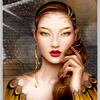
Nous plaçons le premier élément au dessus, auquel nous appliquons une ombre inclinée, afin que seule une partie de l'ombre soit visible; survolez l'image par la droite pour faire apparaître l'ombre cachée.
<div style="width: 820px; height: 470px; text-align: center; margin: 10px auto;">
<p id="cont"> </p>
<p id="omb1"> </p>
</div>
<style><!--
#cont{position:absolute; z-index:5; width:800px; height:450px; border:4px solid white;, box-sizing:border-box; margin: 10px auto; background:url('http://ekladata.com/jWQzglzf-z_BACidHMS-hS0oohM.jpg');}
#omb1{position:absolute; z-index:1; width:100px; height:400px; border:2px solid black; box-shadow:-10px 0px 20px black; transform:translate(10px,40px) rotate(-2deg); background:rgba(0,0,0,0.8);}
--></style>
Dans cet exemple, le montage est placé dans une div que je centre dans ma page, pour la présentation mais ceci n'est qu'un agencement personnel.
L'élément id="cont" est placé en position absolue et en premier plan (z-index:5;); il contient notre image ou notre texte, décoré(e) selon notre choix.
L'élément id="omb1" est placé en position absolute mais sous notre contenu (z-index:1;); il est incliné (rotate(-2deg) selon le sens de notre montage.
Ombres latérales; survolez le montage pour voir le positionnement des 2 ombres.
2 ombres arrondies placée latéralement à ajuster selon vos choix.
<div style="width: 820px; height: 470px; text-align: center; margin: 10px auto;">
<p id="conta"> </p>
<p id="omb1a"> </p>
<p id="omb1b"> </p>
</div>
<style><!--
#conta{position:absolute; z-index:5; width:800px; height:450px; border:4px solid white;, box-sizing:border-box; margin: 10px auto; background:url('http://ekladata.com/6NCl-OkW14z7Hjld-oiopcJ-zc8.jpg');}
#omb1a{position:absolute; z-index:1; width:50px; height:300px; border-radius:50%; border:2px solid black; box-shadow:-10px 0px 20px black; transform:translate(5px,75px); background:rgba(0,0,0,0.8);}
#omb1b{position:absolute; z-index:1; width:50px; height:300px; border-radius:50%; border:2px solid black; box-shadow:10px 0px 20px black; transform:translate(748px,75px) ; background:rgba(0,0,0,0.8);}
--></style>
1 ombre arrondie placée en bas le montage.
<div style="width: 820px; height: 490px; text-align: center; margin: 10px auto;">
<p id="cont2"> </p>
<p id="omb2a"> </p>
</div><style><!--
#cont2{position:absolute; z-index:5; width:800px; height:450px; border:4px solid white;, box-sizing:border-box; margin: 10px auto; background:url('http://ekladata.com/CKuUo_jazvKCAQnVrZX7tCEKn18.jpg');}
#omb2a{position:absolute; z-index:1; width:600px; height:100px; border-radius:50%; border:2px solid black; box-shadow:0px 10px 20px black; transform:translate(100px,350px); background:rgba(0,0,0,0.8);}
--></style>
2 ombres placées aux angles bas du montage.
<div style="width: 820px; height: 490px; text-align: center; margin: 10px auto;">
<p id="cont3"> </p>
<p id="omb3a"> </p>
<p id="omb3b"> </p>
</div><style><!--
#omb3a{position:absolute; z-index:1; width:300px; height:50px; border:2px solid black; box-shadow:0px 20px 20px black; transform:translate(20px,400px) rotate(-5deg) skewx(-8deg); background:rgba(0,0,0,0.8);}
#omb3b{position:absolute; z-index:1; width:300px; height:50px; border:2px solid black; box-shadow:0px 20px 20px black; transform:translate(490px,400px) rotate(5deg) skewx(8deg); background:rgba(0,0,0,0.8);}
--></style>
Voilà pour le principe, qui est à ajuster à votre page et à vos montages; les images peuvent être en arrondies ou sous d'autres formes, en adaptant les ombres en conséquence.
Attention en cours de réalisation: l'affichage en prévisualisation est différent de celui en publication et les valeurs doivent être ajustées.
Mon article avec texte et images.
div style="width: 1020px; height: 490px; text-align: center; margin: 10px auto;">
<div id="cont4"><br />Mon article avec texte et images.<img src="http://ekladata.com/U5QsPKdEE6BaGKWQvxzw65GhUdw.gif" alt="" />*</div>
<p id="omb4a"> </p>
<p id="omb4b"> </p>
</div>
<style><!--
#cont4{position:absolute; z-index:5; width:1000px; height:450px; border:4px solid white;, box-sizing:border-box; margin: 10px auto; background: linear-gradient(to top, #f6e6b4 0%,#ed9017 100%); text-align:center; font-size:14pt; box-shadow:inset 0px 0px 18px 10px grey;}
#omb4a{position:absolute; z-index:1; width:400px; height:50px; border:2px solid black; box-shadow:0px 20px 20px black; transform:translate(20px,390px) rotate(-5deg) skewx(-8deg); background:rgba(0,0,0,0.8);}
#omb4b{position:absolute; z-index:1; width:400px; height:50px; border:2px solid black; box-shadow:0px 20px 20px black; transform:translate(590px,390px) rotate(5deg) skewx(8deg); background:rgba(0,0,0,0.8);}
--></style>
montages par codes HTML/CSS
 Créer mon blog