


-
Ombre décalée
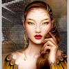
Il est simple de placer une ombre, derrière une image, pour donner un effet de relief.
Cette ombre peut être décalée pour simuler une inclinaison.
<div style="width: 900px; height: 500px; margin: 10px auto;">
<p id="poet1"> </p>
<p id="poet2"> </p>
</div>
<div style="width: 900px; height: 500px; margin: 10px auto;">
<p id="poet3"> </p>
<p id="poet4"> </p>
<p id="poet5"> </p>
</div>
<style><!--
#poet1{position:absolute; z-index:1; width:700px; height:350px; background:rgba(0,0,0,0.2); box-shadow:5px 0px 40px 5px rgba(0,0,0,1); transform:translate(90px,90px) skewx(-3deg);}
#poet2{position:absolute; z-index:2; width:800px; height:450px; border:4px ridge white;background:url('http://ekladata.com/HxVFAqoJ9FUMwL9udme6LnllPoc.jpg'); background-size:800px 450px;}
#poet3{position:absolute; z-index:1; width:300px; height:400px; border-radius:50%; background:rgba(0,0,0,0.2); box-shadow:5px 0px 40px 5px rgba(0,0,0,1); transform:translate(0px,30px);}
#poet4{position:absolute; z-index:1; width:300px; height:400px; border-radius:50%; background:rgba(0,0,0,0.2); box-shadow:5px 0px 40px 5px rgba(0,0,0,1); transform:translate(500px,30px);}
#poet5{position:absolute; z-index:2; width:800px; height:450px; border:4px ridge white;background:url('http://ekladata.com/HxVFAqoJ9FUMwL9udme6LnllPoc.jpg'); background-size:800px 450px;}
--></style>
montages par codes HTML/CSS
 Créer mon blog