


-
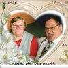
Meli melo survol
Le même au survol; on pourrait, avec cette écriture mélanger le clic et le survol, en l'indiquant sur le bouton.
Chaque image est positionnée individuellement.
Survol de chaque bouton pour afficher une nouvelle image.
<div style="width: 60vw; height: 33.75vw; margin: 2vh auto; border: 0.2vh solid white; background: linear-gradient(to bottom, rgba(50,100,150,0.9) 0%, rgba(50,100,150,0.5) 100%);"><input id="ong1" class="ong" type="text" value="A" /><input id="ong2" class="ong" type="text" value="B" /><input id="ong3" class="ong" type="text" value="C" /><input id="ong4" class="ong" type="text" value="D" /><input id="ong5" class="ong" type="text" value="E" /><input id="ong6" class="ong" type="text" value="F" /><input id="ong7" class="ong" type="text" value="G" />
<p id="gh0"><br />Clic sur chaque bouton pour afficher une nouvelle image.</p>
<p id="gh1" class="gh"> </p>
<p id="gh2" class="gv"> </p>
<p id="gh3" class="gh"> </p>
<p id="gh4" class="gv"> </p>
<p id="gh5" class="gh"> </p>
<p id="gh6" class="gv"> </p>
<p id="gh7" class="gh"> </p>
</div>
<style><!--
.ong{position:absolute; z-index:15; width:1vw; height:2vw; border:0.1vh solid black; box-shadow:inset -0.2vh -0.2vh 0.2vh black;text-align:center; line-height:2vw; font-size:1vw;}
#ong1{transform:translate(58.5vw,0vw);}
#ong2{transform:translate(58.5vw,2vw);}
#ong3{transform:translate(58.5vw,4vw);}
#ong4{transform:translate(58.5vw,6vw);}
#ong5{transform:translate(58.5vw,8vw);}
#ong6{transform:translate(58.5vw,10vw);}
#ong7{transform:translate(58.5vw,12vw);}
#gh0{position:absolute; z-index:1; width:50vw; height:33.75vw; text-align:center; font-size:1.5vw; color:white; text-shadow:0.1vh 0.1vh black; transform:translate(5vw,0vw);}.gh{position:absolute; z-index:2; width:16vw; height:9vw; border:0.3vh solid white; box-shadow:0.3vh 0.3vh 0.5vh black; transition:all 1s linear;}
.gv{position:absolute; z-index:2; width:9vw; height:16vw; border:0.3vh solid white; box-shadow:0.3vh 0.3vh 0.5vh black; transition:all 1s linear;}
#gh1{background:url('http://ekladata.com/U0Mut8nNfmF7IZhtFd5si7fDHYI.jpg'); background-size:cover; transform:translate(5vw,5vw) rotate(10deg);}
#gh2{background:url('http://ekladata.com/T-mg4gRvJ7AEEfwNQrgz1A1acoc.jpg'); background-size:cover; transform:translate(7vw,15vw) rotate(-10deg);}
#gh3{background:url('http://ekladata.com/UaUUp4-eE-0bZkcC-fEaFPZv4sQ.jpg'); background-size:cover; transform:translate(15vw,20vw) rotate(0deg);}
#gh4{background:url('http://ekladata.com/XMUnfuoix-tSzb5pI_3z6aJnka4.jpg'); background-size:cover; transform:translate(22vw,6vw) rotate(-5deg);}
#gh5{background:url('http://ekladata.com/N_FAFmJLgq53ABEsjeaz3SEplyc.jpg'); background-size:cover; transform:translate(32vw,10vw) rotate(10deg);}
#gh6{background:url('http://ekladata.com/dyVynkaIezfIpVvq_woifBAzKOw.jpg'); background-size:cover; transform:translate(45vw,7vw) rotate(-10deg);}
#gh7{background:url('http://ekladata.com/vU34muVTg0gnJTeZvUTRwjOwgNg.jpg'); background-size:cover; transform:translate(35vw,20vw) rotate(-10deg);}#ong1:focus ~ #gh1,#ong3:focus ~ #gh3,#ong5:focus ~ #gh5,#ong7:focus ~ #gh7{z-index:10; width:60vw; height:33.75vw; border:none; box-shadow:none; transform:translate(0vw,0vw) rotate(0deg);}
#ong2:focus ~ #gh2,#ong4:focus ~ #gh2,#ong6:focus ~ #gh6{z-index:10; width:19vw; height:33.75vw; border:none; box-shadow:none; transform:translate(20vw,0vw) rotate(0deg);}
--></style>
montages par codes HTML/CSS
 Créer mon blog