


-
Background-position
Toujours avec des images en 700x525px, rapport 4/3.
Comment sélectionner une partie précise d'une image pour l'afficher en entier, au survol: reprise du code indiqué dans la page précédente, avec un autre image.
La sélection est centrée et ronde. Survolez chaque exemple.
<div style="width: 700px; height: 540px; margin: 10px auto;">
<p id="j1" style="text-align: center;"> </p>
</div>
<style><!--
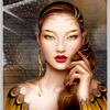
#j1{width:140px; height:140px; border-radius:50%; border:4px solid grey; transform:translate(280px,200px); background:url('http://ekladata.com/5aKI9zjTHxjKMiWjO0j6Po2eFd8.jpg'); background-position:50% 50%; transition:all 2s linear;}
#j1:hover{width:700px; height:525px; border-radius:0%; transform:translate(0px,0px);}
--></style>Utilisons une autre image et une sélection différente:
<div style="width: 700px; height: 540px; margin: 10px auto;">
<p id="j2" style="text-align: center;"> </p>
</div>
<style><!--
#j2{width:140px; height:140px; border:4px solid grey; transform:translate(308px,53px); background:url('http://ekladata.com/PdH6u0luO6IE1M85izgaO5NSgkI.jpg'); background-position:60% 10%; transition:all 2s linear;}
#j2:hover{width:700px; height:525px; transform:translate(0px,0px);}
--></style>Le positionnement de la vignette est à adapter à l'emplacement de la sélection choisie afin qu'elle semble ne pouger qu'un minimum, au survol.
Et une dernière, pour la route !
<div style="width: 700px; height: 540px; margin: 10px auto;">
<p id="j3" style="text-align: center;"> </p>
</div>
<style><!--
#j3{width:100px; height:100px; border-radius:50%; border:4px solid grey; transform:translate(300px,210px) rotate(180deg); background:url('http://ekladata.com/u_pVypcojIdF6YT2_1biMBnGSLU.jpg'); background-position:50% 50%; transition:all 2s linear;}
#j3:hover{width:700px; height:525px; transform:translate(0px,0px) rotate(0deg); border-radius:0%;}
--></style>
montages par codes HTML/CSS
 Créer mon blog