


-
Animation sur filtre1
Avant de me lancer sur une idée, je vais vérifier sur une page si je peux la réaliser.
Mon idée de départ n'était pas celle là mais il faut bien commencer par un brouillon.
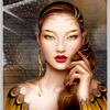
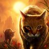
Survolez le motif central.
<div style="position: relative; width: 800px; height: 600px; margin: 5px auto; border: 4px ridge white; background: url('http://ekladata.com/6zkI1RU7rwNMYoAphFHzsvmDL_s/tile1.jpg');">
<p id="a2"> </p>
<p id="a1"> </p>
</div>
<style type="text/css"><!--
#a1{transition:translate 1s linear 0s, opacity 1s linear 2s; position:absolute; z-index:1; width: 800px; height: 600px; background: url('http://ekladata.com/NphJwjPOVIlqZVhkiQfDplKmmZM/6501.jpg'); opacity:0;}
#a2{transition:transform 2s linear 0s, width 2s linear 0s, height 2s linear 0s, background 2s linear 0s, opacity 1s linear 3s; position:absolute; z-index:2; border: 4px ridge white; background:url('http://ekladata.com/Ezkq5TL2rhOIYDl2ZEqoJFAASYI/6501v.gif'); width:160px; height:120px; background-position:-320px -240px; transform:translate(320px,240px); opacity:1;}
#a2:hover{width:800px; height:600px; transform:translate(0px,0px); background-position:0px 0px; opacity:0;}
#a2:hover ~ #a1{opacity:1;}
--></style>
L'image de fond a1 est la photo en clair et celle de a2, est celle avec un filtre the Gimp.
montages par codes HTML/CSS
 Créer mon blog