


-
Variante pour Henri
En reprenant le code de "pour Henri", on peut réaliser une variante où le survol d'une section fait pivoter les 3 autres sections correspondantes.
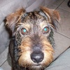
Voici un premier jet, en brut de fonderie: 4 images en 800x600px; les boutons sont invisibles et placés sur chaque section.
<div style="width: 800px; height: 600px; border: 4px solid grey; background: url('http://ekladata.com/udT-a91y1onmJ_y6ozd5odfAwzk/hump.jpg'); margin: 5px auto;">
<p id="bt1"> </p>
<p id="bt2"> </p>
<p id="bt3"> </p>
<p id="bt4"> </p>
<p id="f1"> </p>
<p id="f1a"> </p>
<p id="f1b"> </p>
<p id="f1c"> </p>
<p id="f2"> </p>
<p id="f2a"> </p>
<p id="f2b"> </p>
<p id="f2c"> </p>
<p id="f3"> </p>
<p id="f3a"> </p>
<p id="f3b"> </p>
<p id="f3c"> </p>
<p id="f4"> </p>
<p id="f4a"> </p>
<p id="f4b"> </p>
<p id="f4c"> </p>
</div>
<style><!--
#bt1{position:absolute; z-index:5; width:200px; height:600px; transform:translate(0px,0px);}
#bt2{position:absolute; z-index:5; width:200px; height:600px; transform:translate(200px,0px);}
#bt3{position:absolute; z-index:5; width:200px; height:600px; transform:translate(400px,0px);}
#bt4{position:absolute; z-index:5; width:200px; height:600px; transform:translate(600px,0px);}
#f1{position:absolute; z-index:1; transition:all 1s linear; transform:translate(0px,0px) rotatey(0deg); width:200px; height:600px; background:url(http://ekladata.com/LBVSB5VPG5140ZHd1jUUEiKrHig.jpg); background-position:0% 0%; backface-visibility: hidden;}
#f1a{position:absolute; z-index:1; transition:all 1s linear; transform:translate(200px,0px) rotatey(180deg); width:200px; height:600px; background:url(http://ekladata.com/LBVSB5VPG5140ZHd1jUUEiKrHig.jpg); background-position:33.3% 0%; backface-visibility: hidden;}
#f1b{position:absolute; z-index:1; transition:all 1s linear; transform:translate(400px,0px) rotatey(180deg); width:200px; height:600px; background:url(http://ekladata.com/LBVSB5VPG5140ZHd1jUUEiKrHig.jpg); background-position:66.6% 0%; backface-visibility: hidden;}
#f1c{position:absolute; z-index:1; transition:all 1s linear; transform:translate(600px,0px) rotatey(180deg); width:200px; height:600px; background:url(http://ekladata.com/LBVSB5VPG5140ZHd1jUUEiKrHig.jpg); background-position:100% 0%; backface-visibility: hidden;}#f2{position:absolute; z-index:1; transition:all 1s linear; transform:translate(0px,0px) rotatey(180deg);width:200px; height:600px; background:url(http://ekladata.com/wGqSWjkbwIaPTNvuU0qdwYyk-2Y.jpg); background-position:0% 0%; backface-visibility: hidden;}
#f2a{position:absolute; z-index:1; transition:all 1s linear; transform:translate(200px,0px) rotatey(0deg);width:200px; height:600px; background:url(http://ekladata.com/wGqSWjkbwIaPTNvuU0qdwYyk-2Y.jpg); background-position:33.3% 0%; backface-visibility: hidden;}
#f2b{position:absolute; z-index:1; transition:all 1s linear; transform:translate(400px,0px) rotatey(180deg);width:200px; height:600px; background:url(http://ekladata.com/wGqSWjkbwIaPTNvuU0qdwYyk-2Y.jpg); background-position:66.6% 0%; backface-visibility: hidden;}
#f2c{position:absolute; z-index:1; transition:all 1s linear; transform:translate(600px,0px) rotatey(180deg);width:200px; height:600px; background:url(http://ekladata.com/wGqSWjkbwIaPTNvuU0qdwYyk-2Y.jpg); background-position:100% 0%; backface-visibility: hidden;}#f3{position:absolute; z-index:1; transition:all 1s linear; transform:translate(0px,0px) rotatey(180deg);width:200px; height:600px; background:url(http://ekladata.com/wwoKLkdCaZAJHlUAKxK33dMbhbU.jpg); background-position:0% 0%; backface-visibility: hidden;}
#f3a{position:absolute; z-index:1; transition:all 1s linear; transform:translate(200px,0px) rotatey(180deg);width:200px; height:600px; background:url(http://ekladata.com/wwoKLkdCaZAJHlUAKxK33dMbhbU.jpg); background-position:33.3% 0%; backface-visibility: hidden;}
#f3b{position:absolute; z-index:1; transition:all 1s linear; transform:translate(400px,0px) rotatey(0deg);width:200px; height:600px; background:url(http://ekladata.com/wwoKLkdCaZAJHlUAKxK33dMbhbU.jpg); background-position:66.6% 0%; backface-visibility: hidden;}
#f3c{position:absolute; z-index:1; transition:all 1s linear; transform:translate(600px,0px) rotatey(180deg);width:200px; height:600px; background:url(http://ekladata.com/wwoKLkdCaZAJHlUAKxK33dMbhbU.jpg); background-position:100% 0%; backface-visibility: hidden;}#f4{position:absolute; z-index:1; transition:all 1s linear; transform:translate(0px,0px) rotatey(180deg);width:200px; height:600px; background:url(http://ekladata.com/spgWSAERgBX0wsC4jMeEe8_J-EQ.jpg); background-position:0% 0%; backface-visibility: hidden;}
#f4a{position:absolute; z-index:1; transition:all 1s linear; transform:translate(200px,0px) rotatey(180deg);width:200px; height:600px; background:url(http://ekladata.com/spgWSAERgBX0wsC4jMeEe8_J-EQ.jpg); background-position:33.3% 0%; backface-visibility: hidden;}
#f4b{position:absolute; z-index:1; transition:all 1s linear; transform:translate(400px,0px) rotatey(180deg);width:200px; height:600px; background:url(http://ekladata.com/spgWSAERgBX0wsC4jMeEe8_J-EQ.jpg); background-position:66.6% 0%; backface-visibility: hidden;}
#f4c{position:absolute; z-index:1; transition:all 1s linear; transform:translate(600px,0px) rotatey(0deg);width:200px; height:600px; background:url(http://ekladata.com/spgWSAERgBX0wsC4jMeEe8_J-EQ.jpg); background-position:100% 0%; backface-visibility: hidden;}#bt1:hover ~ #f1a{z-index:5; transform:translate(200px,0px) rotatey(0deg);}
#bt1:hover ~ #f1b{z-index:5; transform:translate(400px,0px) rotatey(0deg);}
#bt1:hover ~ #f1c{z-index:5; transform:translate(600px,0px) rotatey(0deg);}
#bt2:hover ~ #f2{z-index:5; transform:translate(0px,0px) rotatey(0deg);}
#bt2:hover ~ #f2b{z-index:5; transform:translate(400px,0px) rotatey(0deg);}
#bt2:hover ~ #f2c{z-index:5; transform:translate(600px,0px) rotatey(0deg);}
#bt3:hover ~ #f3{z-index:5; transform:translate(0px,0px) rotatey(0deg);}
#bt3:hover ~ #f3a{z-index:5; transform:translate(200px,0px) rotatey(0deg);}
#bt3:hover ~ #f3c{z-index:5; transform:translate(600px,0px) rotatey(0deg);}
#bt4:hover ~ #f4{z-index:5; transform:translate(0px,0px) rotatey(0deg);}
#bt4:hover ~ #f4a{z-index:5; transform:translate(200px,0px) rotatey(0deg);}
#bt4:hover ~ #f4b{z-index:5; transform:translate(400px,0px) rotatey(0deg);}
--></style>
montages par codes HTML/CSS
 Créer mon blog