


-
Remise en place 4
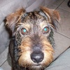
Je sais que la demande est pour un format 800x600px mais voici déjà un format 1000x500px, avant le second en 800x600px.
Survolez les montages.
Ce sera la dernière page de la série; je vous laisse imaginer d'autres montages et d'autres animations.
<div id="at">
<p id="at0"> </p>
<p id="at1" class="a"> </p>
<p id="at2" class="a"> </p>
<p id="at3" class="a"> </p>
<p id="at4" class="a"> </p>
<p id="at5" class="a"> </p>
<p id="at6" class="a"> </p>
<p id="at7" class="a"> </p>
<p id="at8" class="a"> </p>
<p id="at9" class="a"> </p>
<p id="at10" class="a"> </p>
<p id="at11" class="a"> </p>
<p id="at12" class="a"> </p>
</div><style><!--
#at{position:relative; width:800px; height:600px; background:url(http://ekladata.com/6zkI1RU7rwNMYoAphFHzsvmDL_s/tile1.jpg); border:6px ridge grey; margin:10px auto;}
#at0{position:absolute; z-index:10; transform:translate(0px,0px); width:800px; height:600px;}
.a{background:url(http://ekladata.com/K7TPTtd_ky6cB5Ml2c-OjP9KSjI/1314.jpg);}
#at1{position:absolute; width:150px; height:150px; border-radius:50%; background-position:0% 0%; transition:all 2s linear; transform:translate(625px,425px) rotatey(180deg);}
#at2{position:absolute; width:150px; height:150px; border-radius:50%; background-position:33% 0%; transition:all 2s linear; transform:translate(225px,425px) rotatey(180deg);}
#at3{position:absolute; width:150px; height:150px; border-radius:50%; background-position:66% 0%; transition:all 2s linear; transform:translate(425px,425px) rotatey(180deg);}
#at4{position:absolute; width:150px; height:150px; border-radius:50%; background-position:100% 0%; transition:all 2s linear; transform:translate(25px,425px) rotatey(180deg);}
#at5{position:absolute; width:150px; height:150px; border-radius:50%; background-position:0% 50%; transition:all 2s linear; transform:translate(625px,225px) rotatey(180deg);}
#at6{position:absolute; width:150px; height:150px; border-radius:50%; background-position:33% 50%; transition:all 2s linear; transform:translate(425px,225px) rotatey(180deg);}
#at7{position:absolute; width:150px; height:150px; border-radius:50%; background-position:66% 50%; transition:all 2s linear; transform:translate(225px,225px) rotatey(180deg);}
#at8{position:absolute; width:150px; height:150px; border-radius:50%; background-position:100% 50%; transition:all 2s linear; transform:translate(25px,225px) rotatey(180deg);}
#at9{position:absolute; width:150px; height:150px; border-radius:50%; background-position:0% 100%; transition:all 2s linear; transform:translate(625px,25px) rotatey(180deg);}
#at10{position:absolute; width:150px; height:150px; border-radius:50%; background-position:33% 100%; transition:all 2s linear; transform:translate(225px,25px) rotatey(180deg);}
#at11{position:absolute; width:150px; height:150px; border-radius:50%; background-position:66% 100%; transition:all 2s linear; transform:translate(425px,25px) rotatey(180deg);}
#at12{position:absolute; width:150px; height:150px; border-radius:50%; background-position:100% 100%; transition:all 2s linear; transform:translate(25px,25px) rotatey(180deg);}#at0:hover ~ #at1{transform:translate(0px,0px) rotatey(0deg); width:200px; height:200px; border-radius:0%; }
#at0:hover ~ #at2{transform:translate(200px,0px) rotatey(0deg); width:200px; height:200px; border-radius:0%; }
#at0:hover ~ #at3{transform:translate(400px,0px) rotatey(0deg) ; width:200px; height:200px; border-radius:0%; }
#at0:hover ~ #at4{transform:translate(600px,0px) rotatey(0deg); width:200px; height:200px; border-radius:0%; }
#at0:hover ~ #at5{transform:translate(0px,200px) rotatey(0deg); width:200px; height:200px; border-radius:0%; }
#at0:hover ~ #at6{transform:translate(200px,200px) rotatey(0deg); width:200px; height:200px; border-radius:0%; }
#at0:hover ~ #at7{transform:translate(400px,200px) rotatey(0deg); width:200px; height:200px; border-radius:0%; }
#at0:hover ~ #at8{transform:translate(600px,200px) rotatey(0deg); width:200px; height:200px; border-radius:0%; }
#at0:hover ~ #at9{transform:translate(0px,400px) rotatey(0deg); width:200px; height:200px; border-radius:0%; }
#at0:hover ~ #at10{transform:translate(200px,400px) rotatey(0deg); width:200px; height:200px; border-radius:0%; }
#at0:hover ~ #at11{transform:translate(400px,400px) rotatey(0deg); width:200px; height:200px; border-radius:0%; }
#at0:hover ~ #at12{transform:translate(600px,400px) rotatey(0deg); width:200px; height:200px; border-radius:0%; }
--></style>
montages par codes HTML/CSS
 Créer mon blog