


-
Perspective 1
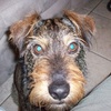
Amusement sur une seule image, pour le principe mais on devrait pour ajouter d'autres images pour faire un montage.
Survolez la partie encadrée.
<div style="width: 1005px; height: 563px; margin: 0px auto;">
<p id="s1" class="cc"> </p>
<p id="s2" class="cc"> </p>
</div>
<style><!--
.cc{background:url('http://ekladata.com/6lg2l5lc3nnsnhJ-E9sB4_IgZGc@1000x563.jpg');}
#s1{float:left; width:200px; height:563px;border:2px solid white; background-position:0px 0px;}
#s2{float:left; width:800px; height:563px; background-position:100% 0%; transform:scale3d(1,1,0.1) perspective(200px) rotatey(60deg); transform-origin:left center; transition:all 2s ease-out;}
#s1:hover{border:none;}
#s1:hover ~ #s2{transform:scale3d(1,1,1) perspective(5000px) rotatey(0deg);}
--></style>
montages par codes HTML/CSS
 Créer mon blog