


-
Filtres et montage
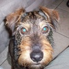
Survolez chaque vignette.
Code qui nécessite d'avoir préparé, au même format, 4 images originales et les mêmes, avec filtre.
<div style="width: 800px; height: 600px; margin: 10px auto; border: 6px ridge white;">
<p id="ph1"> </p>
<p id="ph1a"> </p>
<p id="ph2"> </p>
<p id="ph2a"> </p>
<p id="ph3"> </p>
<p id="ph3a"> </p>
<p id="ph4"> </p>
<p id="ph4a"> </p>
</div>
<style type="text/css"><!--
#ph1{transition: transform 2s linear 0s, width 2s linear 0s, height 2s linear 0s, opacity 2s linear 2s; position:absolute; z-index:5; width:400px; height:300px; transform:translate(0px,0px); outline:3px solid white; outline-offset:-3px; background:url('http://ekladata.com/44ZNs9LICot-gBQzHUC-NSIYLG8/6567f.jpg'); background-size:cover;}
#ph1a{transition: transform 2s linear 0s, width 2s linear 0s, height 2s linear 0s, opacity 2s linear 0s; position:absolute; z-index:4; width:400px; height:300px; transform:translate(0px,0px); background:url('http://ekladata.com/GNcRat7IcYHdHFDdeXvfhu7QvDA/6567.jpg'); background-size:cover; opacity:0;}
#ph1:hover{ width:800px; height:600px;transform:translate(0px,0px); z-index:7; opacity:0;}
#ph1:hover ~ #ph1a{ width:800px; height:600px; transform:translate(0px,0px); z-index:6; opacity:1;}
#ph2{transition: transform 2s linear 0s, width 2s linear 0s, height 2s linear 0s, opacity 2s linear 2s; position:absolute; z-index:5; width:400px; height:300px; transform:translate(400px,0px); outline:3px solid white; outline-offset:-3px; background:url('http://ekladata.com/itilX5TjySvd_BRaV7mXdlQYbRU/6579f.jpg'); background-size:cover;}
#ph2a{transition: transform 2s linear 0s, width 2s linear 0s, height 2s linear 0s, opacity 2s linear 0s; position:absolute; z-index:4; width:400px; height:300px; transform:translate(400px,0px); background:url('http://ekladata.com/B5lexbkP37ox9MrI1pbl_rkgnpw/6579.jpg'); background-size:cover; opacity:0;}
#ph2:hover{ width:800px; height:600px;transform:translate(0px,0px); z-index:7; opacity:0;}
#ph2:hover ~ #ph2a{ width:800px; height:600px; transform:translate(0px,0px); z-index:6; opacity:1;}
#ph3{transition: transform 2s linear 0s, width 2s linear 0s, height 2s linear 0s, opacity 2s linear 2s; position:absolute; z-index:5; width:400px; height:300px; transform:translate(0px,300px); outline:3px solid white; outline-offset:-3px; background:url('http://ekladata.com/I-KDfBbVB_A8NPxNPWZ95MFJAPQ/6581f.jpg'); background-size:cover;}
#ph3a{transition: transform 2s linear 0s, width 2s linear 0s, height 2s linear 0s, opacity 2s linear 0s; position:absolute; z-index:4; width:400px; height:300px; transform:translate(0px,300px); background:url('http://ekladata.com/XeHa1tfPf5680SmHCWqj24Z9_tY/6581.jpg'); background-size:cover; opacity:0;}
#ph3:hover{ width:800px; height:600px;transform:translate(0px,0px); z-index:7; opacity:0;}
#ph3:hover ~ #ph3a{ width:800px; height:600px; transform:translate(0px,0px); z-index:6; opacity:1;}
#ph4{transition: transform 2s linear 0s, width 2s linear 0s, height 2s linear 0s, opacity 2s linear 2s; position:absolute; z-index:5; width:400px; height:300px; transform:translate(400px,300px); outline:3px solid white; outline-offset:-3px; background:url('http://ekladata.com/tKCRSguBOZSyLAjsZRQw8Ynarqw/6585g.jpg'); background-size:cover;}
#ph4a{transition: transform 2s linear 0s, width 2s linear 0s, height 2s linear 0s, opacity 2s linear 0s; position:absolute; z-index:4; width:400px; height:300px; transform:translate(400px,300px); background:url('http://ekladata.com/3hkXgequNmcGnKKXOGThLt1PGqA/6585.jpg'); background-size:cover; opacity:0;}
#ph4:hover{ width:800px; height:600px;transform:translate(0px,0px); z-index:7; opacity:0;}
#ph4:hover ~ #ph4a{ width:800px; height:600px; transform:translate(0px,0px); z-index:6; opacity:1;}
--></style>
...
Chaque couple image originale + avec filtre, reçoit une animation particulière
...
montages par codes HTML/CSS
 Créer mon blog