


-
Faux clip
L'article que j'ai proposé utilise un code (clip) moins pratique que celui d'une sélection du fond.
Puisqu'on me demande le code, je vous le propose avec ce dernier code: le résultat est le même et on peut ajouter une décoration.
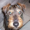
La partie visible de chaque vignette est le centre de l'image mais on peut choisir une autre partie (background-position:center center;).
Les vignettes à survoler sont rectangulaires mais vous pouvez les transformer en carré, ovale ou rond.
<div style="width: 80vw; height: 90vh; background: linear-gradient(to bottom, #b68d4c 0%,#e9d4b3 100%); border: 0.1vw solid black; margin: 0vh auto;">
<p id="cl1"> </p>
<p id="cl2"> </p>
<p id="cl3"> </p>
<p id="cl4"> </p>
<p id="cl5"> </p>
<p id="cl6"> </p>
<p id="cl7"> </p>
<p id="cl8"> </p>
<p id="cl9"> </p>
</div>
<style type="text/css"><!--
#cl1{position: absolute; z-index:1; transition:all 1s linear; width: 20vw; height: 10vh; border:0.2vw solid white; box-shadow:0.2vh 0.2vh 0.4vh black; transform:translate(5vw,5vh); background:url('http://ekladata.com/DFko6iT38PCyUauTKuAMO6CD9oo.jpg'); background-size:10vw 10h; background-position:center}
#cl2{position: absolute; z-index:1; transition:all 1s linear; width: 20vw; height: 10vh; border:0.2vw solid white; box-shadow:0.2vh 0.2vh 0.4vh black; transform:translate(55vw,5vh);background:url('http://ekladata.com/rvXGAf-xTXWAEEn4DLF77qdnzTE.jpg'); background-size:10vw 10h; background-position:center}
#cl3{position: absolute; z-index:1; transition:all 1s linear; width: 20vw; height: 10vh; border:0.2vw solid white; box-shadow:0.2vh 0.2vh 0.4vh black; transform:translate(15vw,20vh);background:url('http://ekladata.com/HJPhenImpZ2B2weM3oHa4yjMtR0.jpg'); background-size:10vw 10h; background-position:center}
#cl4{position: absolute; z-index:1; transition:all 1s linear; width: 20vw; height: 10vh; border:0.2vw solid white; box-shadow:0.2vh 0.2vh 0.4vh black; transform:translate(45vw,20vh);background:url('http://ekladata.com/K3mzeGZfW2EpyutcH3-1yZX-Vb0.jpg'); background-size:10vw 10h; background-position:center}
#cl5{position: absolute; z-index:1; transition:all 1s linear; width: 20vw; height: 10vh; border:0.2vw solid white; box-shadow:0.2vh 0.2vh 0.4vh black; transform:translate(30vw,35vh);background:url('http://ekladata.com/ZfkOhpBURy9Rwij8sE2k9fbawBI.jpg'); background-size:10vw 10h; background-position:center}
#cl6{position: absolute; z-index:1; transition:all 1s linear; width: 20vw; height: 10vh; border:0.2vw solid white; box-shadow:0.2vh 0.2vh 0.4vh black; transform:translate(15vw,50vh);background:url('http://ekladata.com/wD5fuNzjg0Izne5YBV0XCgQIHA8.jpg'); background-size:10vw 10h; background-position:center}
#cl7{position: absolute; z-index:1; transition:all 1s linear; width: 20vw; height: 10vh; border:0.2vw solid white; box-shadow:0.2vh 0.2vh 0.4vh black; transform:translate(45vw,50vh);background:url('http://ekladata.com/AKPzMgvLtcXev__ddRNZbNtzAQE.jpg'); background-size:10vw 10h; background-position:center}
#cl8{position: absolute; z-index:1; transition:all 1s linear; width: 20vw; height: 10vh; border:0.2vw solid white; box-shadow:0.2vh 0.2vh 0.4vh black; transform:translate(5vw,70vh);background:url('http://ekladata.com/WWv2qrYrW_wtCsgC0XxtpUFHuQ4.jpg'); background-size:10vw 10h; background-position:center}
#cl9{position: absolute; z-index:1; transition:all 1s linear; width: 20vw; height: 10vh; border:0.2vw solid white; box-shadow:0.2vh 0.2vh 0.4vh black; transform:translate(55vw,70vh);background:url('http://ekladata.com/JoB5A2F3Uy-KjkmImFp4nCuEoMM.jpg'); background-size:10vw 10h; background-position:center}#cl1:hover,#cl2:hover,#cl3:hover,#cl4:hover,#cl5:hover,#cl6:hover,#cl7:hover,#cl8:hover,#cl9:hover{z-index:10;width:80vw; height:90vh; background-size:80vw 90vh; transform:translate(0vw,0vh);border:none; box-shadow:0vh 0vh 0vh black; }
--></style>
montages par codes HTML/CSS
 Créer mon blog